
 12:23 PM
 Kamiel Choi

Bob the Builder likes women with brick tits.
Using Autohotkey
If you're using windows (any version), there's an easy way of automating many routine tasks: the popular tool autohotkey (AHK). Not only is it the quickest way of automating simple windows tasks, it also lets you record or write macros and is much, much more powerful than a batch-file.
Using dlvr.it
Thought you need a bulky application like hootsuite or tweetdeck to achieve decent reach for your feeds and posts? Think again. With dlvr.it you can set up multiple "route" from RSS-source to FB, TW, or tumblr-target. Did I mention it's free?

Wordpress vs. Drupal
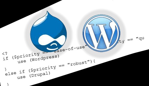
By many considered the nr. 1 and nr. 2 content management / blogging systems, there are a few stubborn preconceptions we have to do away with. Here are two extremely active open source communities that both produce great software products. I'll explain what to use in which situation.
Sunday, December 20, 2015
Tuesday, December 8, 2015
Weekly changing random number
Simple task: How do we generate a random number that automatically changes every certain period of time. Of course, we use the week number when calculating the random number. Also, we have to cache a “large integer” that will not change until the end of the week to get a deterministic random-enough number.
The result can look something like this when we integrate it in a WordPress menu and we only take into account the tags with a minimum number of posts.
$the_tags = get_tags();
foreach ($the_tags as $t) {
if ($t->count>INFOCUS_MIN) $ft[] = $t;
}
$tag = $ft[abs(SOME_LARGE_INTEGER * date(“W”) % sizeof($ft))];
$link = get_tag_link($tag->term_id);
$infocus = ‘<li id=”menu-item-featured-tag” class=”menu-item”><a href=”‘.$link.'”>’ . __(‘In focus: ‘)
. $tag->name.'</a></li>’;
This might be useful and hooking this simple stuff into a menu doesn’t really justify a plugin. But it can be extended with other functionality. We can call it Magic Menu Items. It could integrate with Jetpack to access statistics, and so on.
Wednesday, October 21, 2015
Gmail notification only for important mails

So I found this useful article on how-to geek. It is free and really simple to set up in gmail. You basically add a filter label and set your notifications only for that label in Android (the label needs to be created on a pc though).
Gmail notification is just a part of the puzzle for freelancers, especially those who want to be the first to respond to job offers.
Tuesday, October 20, 2015

Wednesday, October 14, 2015
Light background (the best way)
When creating a fixed background image there are a few things to consider:
- browser compatibility. Does that z-index work everywhere?
- image size. Does this load fast enough on a 3G connection?
- ease of change. What happens when the theme updates?
I found that the easiest way is to set the background-image property via the add-on CSS. That way it is “in between” the theme layer and the individual page. Adding an <IMG> is also possible straight from the content but it gives you z-index headaches. The content elements just don’t seem to go in front of the image element.
So on creativechoice.org I just added this 12k file stretched as the background of site-content:
.site-content { background-image: url("http://creativechoice.org/wp-content/uploads/2015/10/bkg.jpg"); background-size: contain; } I hard-coded the opacity in the file. If you need more flexibility you could consider using the IMG-tag, however that might mean restructuring your HTML-structure to have all navigation elements (links) placed on top of it.
Monday, May 18, 2015
LESS in 5 minutes
LESS is a handy precompiler for CSS, but as it develops it becomes so complex we start assuming that we need a tutorial or long read in order to understand it. I think it’s worthwhile to use just a few very basic capabilities of LESS (leaner CSS) and that you can learn how to use them in 5 minutes.
First, on Windows you can use http://winless.org/
If you use WordPress, install Jetpack which comes with an extra CSS option allowing LESS (or use another plugin that has integrated the PHP LESS-compiler).
No sweat so far.
Take an old CSS file and replace color codes with variables like so:
  body {
  color : 77da34;
  }
becomes
  @green : 77da34;
  body {
  color : @green;
  }
Variables are the first thing we absolutely NEED if we want to write leaner CSS. The next is mixins:
Instead of
opacity : .75;
you write
  .opacity (@opacity: 0.5) {
  -webkit-opacity: @opacity;
  -moz-opacity: @opacity;
  opacity: @opacity;
  }
  .element {
  .opacity (.75);
  }
Et voilà. This is very handy for browser compatibility and with Media Queries.
Let’s offer some flesh. Here is a file of predefined mixins I found on the net and frequently use: more.less. Feel free to use.
More.less
  /* http://designshack.net/articles/css/10-less-css-examples-you-should-steal-for-your-projects/
  */
@base: 663333;
@complement1: spin(@base, 180);
@complement2: darken(spin(@base, 180), 5%);
@lighten1: lighten(@base, 15%);
@lighten2: lighten(@base, 30%);
@lighter1: lighten(spin(@base, 5), 10%);
@lighter2: lighten(spin(@base, 10), 20%);
@darker1: darken(spin(@base, -5), 10%);
@darker2: darken(spin(@base, -10), 20%);
.opacity (@opacity: 0.5) {
-webkit-opacity: @opacity;
-moz-opacity: @opacity;
opacity: @opacity;
}
.border-radius (@radius: 5px) {
-webkit-border-radius: @radius;
-moz-border-radius: @radius;
border-radius: @radius;
}
.box-shadow (@string: 2px 2px 4px rgb(0,0,0,0.5)) {
-webkit-box-shadow: @string;
-moz-box-shadow: @string;
box-shadow: @string;
}
.drop-shadow (@x: 0, @y: 1px, @blur: 2px, @spread: 0, @alpha: 0.25) {
-webkit-box-shadow: @x @y @blur @spread rgba(0, 0, 0, @alpha);
-moz-box-shadow: @x @y @blur @spread rgba(0, 0, 0, @alpha);
box-shadow: @x @y @blur @spread rgba(0, 0, 0, @alpha);
}
.inner-shadow (@x: 0, @y: 1px, @blur: 2px, @spread: 0, @alpha: 0.25) {
-webkit-box-shadow: inset @x @y @blur @spread rgba(0, 0, 0, @alpha);
-moz-box-shadow: inset @x @y @blur @spread rgba(0, 0, 0, @alpha);
box-shadow: inset @x @y @blur @spread rgba(0, 0, 0, @alpha);
}
.transition (@prop: all, @time: 1s, @ease: linear) {
-webkit-transition: @prop @time @ease;
-moz-transition: @prop @time @ease;
-o-transition: @prop @time @ease;
-ms-transition: @prop @time @ease;
transition: @prop @time @ease;
}
.transitions (@transitions) {
-webkit-transition: @transitions;
-moz-transition: @transitions;
-o-transition: @transitions;
-ms-transition: @transitions;
transition: @transitions;
}
.animation (@name, @duration: 300ms, @delay: 0, @ease: ease) {
-webkit-animation: @name @duration @delay @ease;
-moz-animation: @name @duration @delay @ease;
-ms-animation: @name @duration @delay @ease;
}
.transform (@rotate: 90deg, @scale: 1, @skew: 1deg, @translate: 10px) {
-webkit-transform: rotate(@rotate) scale(@scale) skew(@skew) translate(@translate);
-moz-transform: rotate(@rotate) scale(@scale) skew(@skew) translate(@translate);
-o-transform: rotate(@rotate) scale(@scale) skew(@skew) translate(@translate);
-ms-transform: rotate(@rotate) scale(@scale) skew(@skew) translate(@translate);
transform: rotate(@rotate) scale(@scale) skew(@skew) translate(@translate);
}
.gradient (@origin: left, @start: ffffff, @stop: 000000) {
background-color: @start;
background-image: -webkit-linear-gradient(@origin, @start, @stop);
background-image: -moz-linear-gradient(@origin, @start, @stop);
background-image: -o-linear-gradient(@origin, @start, @stop);
background-image: -ms-linear-gradient(@origin, @start, @stop);
background-image: linear-gradient(@origin, @start, @stop);
}
.quick-gradient (@origin: left, @alpha: 0.2) {
background-image: -webkit-linear-gradient(@origin, rgba(0,0,0,0.0), rgba(0,0,0,@alpha));
background-image: -moz-linear-gradient(@origin, rgba(0,0,0,0.0), rgba(0,0,0,@alpha));
background-image: -o-linear-gradient(@origin, rgba(0,0,0,0.0), rgba(0,0,0,@alpha));
background-image: -ms-linear-gradient(@origin, rgba(0,0,0,0.0), rgba(0,0,0,@alpha));
background-image: linear-gradient(@origin, rgba(0,0,0,0.0), rgba(0,0,0,@alpha));
}
.reflect (@length: 50%, @opacity: 0.2){
-webkit-box-reflect: below 0px -webkit-gradient(linear, left top, left bottom, from(transparent), color-stop(@length, transparent), to(rgba(255,255,255,@opacity)));
}
.scale (@factor) {
-webkit-transform: scale(@factor);
-moz-transform: scale(@factor);
-ms-transform: scale(@factor);
-o-transform: scale(@factor);
}
.rotate (@deg) {
-webkit-transform: rotate(@deg);
-moz-transform: rotate(@deg);
-ms-transform: rotate(@deg);
-o-transform: rotate(@deg);
}
.skew (@deg, @deg2) {
-webkit-transform: skew(@deg, @deg2);
-moz-transform: skew(@deg, @deg2);
-ms-transform: skew(@deg, @deg2);
-o-transform: skew(@deg, @deg2);
}
.translate (@x, @y:0) {
-webkit-transform: translate(@x, @y);
-moz-transform: translate(@x, @y);
-ms-transform: translate(@x, @y);
-o-transform: translate(@x, @y);
}
.translate3d (@x, @y: 0, @z: 0) {
-webkit-transform: translate3d(@x, @y, @z);
-moz-transform: translate3d(@x, @y, @z);
-ms-transform: translate3d(@x, @y, @z);
-o-transform: translate3d(@x, @y, @z);
}
.perspective (@value: 1000) {
-webkit-perspective: @value;
-moz-perspective: @value;
-ms-perspective: @value;
perspective: @value;
}
.transform-origin (@x:center, @y:center) {
-webkit-transform-origin: @x @y;
-moz-transform-origin: @x @y;
-ms-transform-origin: @x @y;
-o-transform-origin: @x @y;
}
@grunge : url(data:image/png;base64,iVBORw0KGgoAAAANSUhEUgAAADIAAAAyCAMAAAAp4XiDAAAAUVBMVEWFhYWDg4N3d3dtbW17e3t1dXWBgYGHh4d5eXlzc3OLi4ubm5uVlZWPj4+NjY19fX2JiYl/f39ra2uRkZGZmZlpaWmXl5dvb29xcXGTk5NnZ2c8TV1mAAAAG3RSTlNAQEBAQEBAQEBAQEBAQEBAQEBAQEBAQEBAQEAvEOwtAAAFVklEQVR4XpWWB67c2BUFb3g557T/hRo9/WUMZHlgr4Bg8Z4qQgQJlHI4A8SzFVrapvmTF9O7dmYRFZ60YiBhJRCgh1FYhiLAmdvX0CzTOpNE77ME0Zty/nWWzchDtiqrmQDeuv3powQ5ta2eN0FY0InkqDD73lT9c9lEzwUNqgFHs9VQce3TVClFCQrSTfOiYkVJQBmpbq2L6iZavPnAPcoU0dSw0SUTqz/GtrGuXfbyyBniKykOWQWGqwwMA7QiYAxi+IlPdqo+hYHnUt5ZPfnsHJyNiDtnpJyayNBkF6cWoYGAMY92U2hXHF/C1M8uP/ZtYdiuj26UdAdQQSXQErwSOMzt/XWRWAz5GuSBIkwG1H3FabJ2OsUOUhGC6tK4EMtJO0ttC6IBD3kM0ve0tJwMdSfjZo+EEISaeTr9P3wYrGjXqyC1krcKdhMpxEnt5JetoulscpyzhXN5FRpuPHvbeQaKxFAEB6EN+cYN6xD7RYGpXpNndMmZgM5Dcs3YSNFDHUo2LGfZuukSWyUYirJAdYbF3MfqEKmjM+I2EfhA94iG3L7uKrR+GdWD73ydlIB+6hgref1QTlmgmbM3/LeX5GI1Ux1RWpgxpLuZ2+I+IjzZ8wqE4nilvQdkUdfhzI5QDWy+kw5Wgg2pGpeEVeCCA7b85BO3F9DzxB3cdqvBzWcmzbyMiqhzuYqtHRVG2y4x+KOlnyqla8AoWWpuBoYRxzXrfKuILl6SfiWCbjxoZJUaCBj1CjH7GIaDbc9kqBY3W/Rgjda1iqQcOJu2WW+76pZC9QG7M00dffe9hNnseupFL53r8F7YHSwJWUKP2q+k7RdsxyOB11n0xtOvnW4irMMFNV4H0uqwS5ExsmP9AxbDTc9JwgneAT5vTiUSm1E7BSflSt3bfa1tv8Di3R8n3Af7MNWzs49hmauE2wP+ttrq+AsWpFG2awvsuOqbipWHgtuvuaAE+A1Z/7gC9hesnr+7wqCwG8c5yAg3AL1fm8T9AZtp/bbJGwl1pNrE7RuOX7PeMRUERVaPpEs+yqeoSmuOlokqw49pgomjLeh7icHNlG19yjs6XXOMedYm5xH2YxpV2tc0Ro2jJfxC50ApuxGob7lMsxfTbeUv07TyYxpeLucEH1gNd4IKH2LAg5TdVhlCafZvpskfncCfx8pOhJzd76bJWeYFnFciwcYfubRc12Ip/ppIhA1/mSZ/RxjFDrJC5xifFjJpY2Xl5zXdguFqYyTR1zSp1Y9p+tktDYYSNflcxI0iyO4TPBdlRcpeqjK/piF5bklq77VSEaA+z8qmJTFzIWiitbnzR794USKBUaT0NTEsVjZqLaFVqJoPN9ODG70IPbfBHKK+/q/AWR0tJzYHRULOa4MP+W/HfGadZUbfw177G7j/OGbIs8TahLyynl4X4RinF793Oz+BU0saXtUHrVBFT/DnA3ctNPoGbs4hRIjTok8i+algT1lTHi4SxFvONKNrgQFAq2/gFnWMXgwffgYMJpiKYkmW3tTg3ZQ9Jq+f8XN+A5eeUKHWvJWJ2sgJ1Sop+wwhqFVijqWaJhwtD8MNlSBeWNNWTa5Z5kPZw5+LbVT99wqTdx29lMUH4OIG/D86ruKEauBjvH5xy6um/Sfj7ei6UUVk4AIl3MyD4MSSTOFgSwsH/QJWaQ5as7ZcmgBZkzjjU1UrQ74ci1gWBCSGHtuV1H2mhSnO3Wp/3fEV5a+4wz//6qy8JxjZsmxxy5+4w9CDNJY09T072iKG0EnOS0arEYgXqYnX! cYHwjTtU NAcMelOd4xpkoqiTYICWFq0JSiPfPDQdnt+4/wuqcXY47QILbgAAAABJRU5ErkJggg==);


